Caught Yellow Handed

Some of you may have heard about the vandalism that occurred at the Tate Modern last weekend. The victim was a Rothko painting called ‘Black on Maroon’ and it was part of a series named the Seagram murals. The culprit had written “a potential piece of ‘Yellowism’.” The culprit has in fact come forward as Vladimir Umanets who is the co- founder of ‘Yellowism’. It is believed that he was trying to draw attention to his movement, as well as increase the value of the painting. But what is ‘Yellowism’? All the articles I have read about this story does not in fact explain fully what it is? Vladimir Umanets says that ‘Yellowism’ is different form art. In art, you have the freedom to interpret how you wish. However in ‘Yellowism’, you don’t have the freedom of interpretation. ‘Yellowism’ is an element of contemporary visual culture. In other words, ‘Yellowism’ is an idea mixed into the modern society of art.

In my opinion, I can’t make heads or tails of this movement. Above all, why draw on a piece of artwork in order to attract people to a movement, which isn’t even to do with art? ‘Yellowism’ is not art nor is it anti- art. So a piece of art should not be vandalized for the publicity of a movement that is trying to tear itself away from the art culture…?

However some believe that he did not vandalize Rothko’s painting.He has even said that the writing increases the value of the painting.It is thought Vladimir Umanets was merely expressing himself onto this piece. This then raises questions. Is expressing oneself onto art vandalism? Or just art in itself? Expressing yourself is seen as art, but is it acceptable to express oneself on another’s expression? And if you understood these questions, what then should be done with Vladimir Umanets? Should he get away with it or be fined etc.?

I personally think he is in the wrong. He has used a painting by a famous artist for his own gain. Although many say any publicity is good publicity, I think that whenever ‘Yellowism’ is mentioned now, people will always think of this crime committed, and that can’t be a good thing.

The Noble, and the Webster

I found two more artists this year that I have loved. These two artists actually work together and they are called Tim Noble and Sue Webster. They create interesting shadows from objects they have made out of everyday things like rubbish. They have even been known to use taxidermy creatures in their artwork. Now you may be thinking that this is very weird but their results are so astounding. The shadows created look like Noble and Webster’s head or a crow. Their artwork is very contrasting and distinct and this technique is so curious, I don’t think I had ever seen something like this before.

So a couple of months ago I did my own photo shoot using the technique of Noble and Webster. When I was doing the photo shoot, my current theme for my art was tree shadows. I made a tree out of rubbish.Although my results were not quite the standard of Noble and Webster’s, I did get some interesting and weird results, which worked well with my project.

I really enjoyed doing the photo shoot and I suggest trying it out for yourself. It is quite easy to replicate, so why not have a go?

All you need is some rubbish, a room that can be made fairly dark, a torch/light source, a camera and a blank wall is always useful. Creating the shape out of rubbish is probably the hardest bit. I would recommend doing a tree or something like it as they are quite easy to make out of rubbish, but if you’re feeling adventurous why not try to recreate your own shadow just like Noble and Webster!

Make sure that the sculpture made out of rubbish can stand on its own though, otherwise taking a photo of the shadow will be quite hard…

Black out all the lights in your designated room and place your sculpture about 2 metres away from the wall. Then get your lamp, torch, light source and point it at the sculpture, the shadow should be created against the wall and your ready to photograph it. I took shots of the shadows at different angles and I moved the sculpture around a bit to make the shadow bigger/smaller but have a play and see what works for you.

It’s really good fun, hope you enjoy it and feel free to post your results I’d love to have a look at them. Also have a look at Noble and Webster’s website to see some of their shadow photos for yourself.

olympic art in the park

The Olympics have arrived and as I write this, I see that we have just won our 20th gold medal. I have managed to visit the Olympic park in London and I thoroughly enjoyed the atmosphere and being dressed in the GB’s flag. However, I am no sports writer and today I’m actually blogging about a sculptor I saw in the park. I don’t know what it’s called or who it’s by- too busy to notice thanks to those dancing coca cola people in the park. If anyone finds out please comment, as I would love to know.

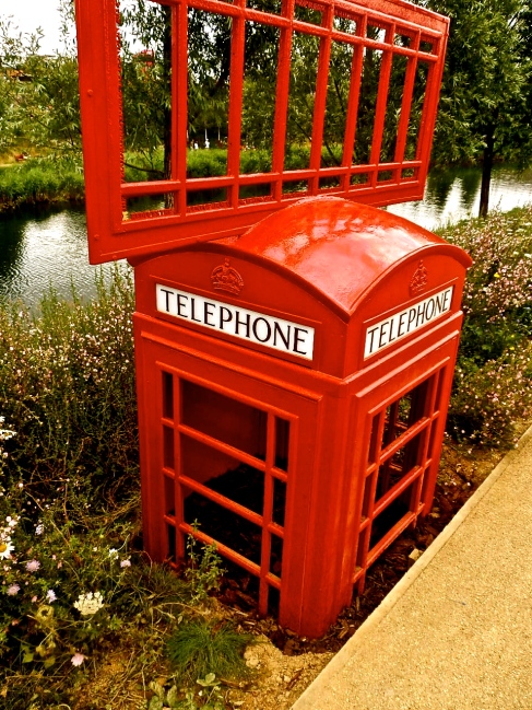
The sculptor I’m talking about is of the classic red phone box you tend to see all over UK. However for some reason, the artist has stuck one of the doors on top of the phone box. Did I forget to mention half of the phone box is buried underground?

This does seem strange but I suppose most of the art in the park was quite odd and random, such as the huge RUN sculptor that apparently lights up at night. But it does make me wonder what the artist was trying to get across with this phone box. I understand why they used a red phone box. All tourists visiting the park would know and recognise our bright red phone boxes just as they would recognise the red buses that go around London. But why is the box half in the ground? Why is a door stuck on the top? It is funny and quite a novel thing to see but why is it in the Olympic park of all places? Particularly since the landscape design of the park is excellent. This red phone box does not seem to fit in with the backdrop of the river and beautiful flowers surrounding it. It feels like someone has literally gone and planted it into the ground and didn’t bother to notice the landscape around them; they didn’t bother to think about where this phone box may fit in. However, maybe that is why this phone box is there- to not fit in? To be honest I can’t be sure and I have never visited any other Olympic park so I have no idea about what sort of sculptors are in Olympic parks. One thing is for sure though; I think it’s one odd sculptor.Image

Summer Exhibition

A couple of weeks ago I finally went to go see the Summer Exhibition at the Royal Academy of Arts. I was looking forward to this trip since I had wanted to go last year and I love the idea that any artist can enter their work into this exhibition.  Of course, since any artist can enter their work I was expecting quality to be varied, and I was not disappointed. There was some excellent artwork; my particular favourite was a painting of a treacle jar. I even got a postcard of it, it just looked so realistic and it was obvious the artist had taken so much care over it.

Looking back there was also artwork that I disliked.  To me, some of the paintings were just plain bad quality. However, after reading some of the introduction to The Story Of Art by E. H Gombrich I suddenly realised that I may have been a bit quick to judge on these paintings. When I came to a painting I would look at it, find it in the catalogue and if I liked it I would analyse and think about the painting, if I didn’t like it then I would just gape at the price, say some snide comment to my friend about it and move on. But now I regret not looking at those paintings. Although at first they may not have seemed aesthetically pleasing to me, if I had bothered to analyse it; look deep into the background and wonder why those figures are in the place that they are, I may have come to really like that piece.

In my last post I wrote about how you should stop and think about a painting, but here I was days later being a hypocrite to my own thoughts. I realise now that being analytical about every painting you see is much harder in practice. It takes time to see the potential in paintings you come across, in this summer exhibition particularly as there are so many pieces of artwork around you. Every wall is covered in paintings with different themes and in different sizes. My advice to anyone thinking about attending this exhibition this summer is to go twice. You simply can’t take it all in in one go. My plan is to go again at some point this summer and not look at the paintings that I like, but the ones that, at my first glance, I don’t particularly like. I want to analyse them and think about why I don’t like them. I want to think about the artist and who they are, and what inspired them.

I do recommend this summer exhibition, not because of the amazing art in it but because of the variety of artwork. It could really open your eyes.

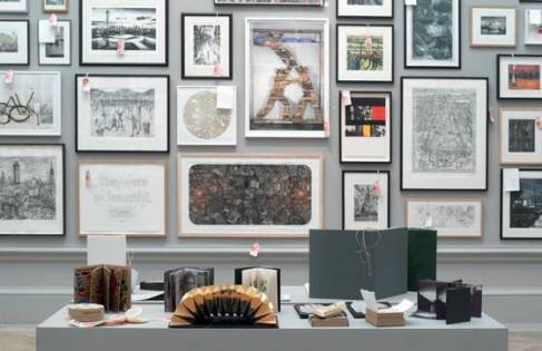
The following photo is off the royal academy website. But I want to show what the walls look like in this exhibition.

Image

Stop, and think

Last week I went to an art exhibition at my local university. Obviously, as the show was degree level, I had high expectations. My expectations were not particularly met but I’m not writing here today about that, instead I wanted to think about this one painting that I was absorbed by. When I say absorbed I mean mesmerized, so much that I didn’t even realise the room emptying around me. The first time I looked away I just thought the reason why I had been so gripped in this particular painting, was by the repetition of the thumbprints. I thought it was a bit like op art in the way that the repetition of patterns and lines causes you to stare at it till your eyes go funny. But then I looked deeper into it and realised there was so much more to this painting than I had thought.


When you look at it without focusing the thumbprints merge and become lines broken by the white thumbprints, like when you look at text without focusing. The artist (unknown to me) had done every thumbprint with such precision and the lines were nearly, completely straight. I noticed the variety of colour as well. The artist had not used black, grey and white. The white was like eggshell. This colour blended into the wall so well at times that all you could see was the actual thumbprint and no change in colour. The greys and blacks had browns and reds and even some yellow in them. This made every print individual. However, I then noticed that the artist had smudged some thumbprints together, maybe where they had printed one thumbprint too closely next to the other? On the other hand, there were some thumbprints that were far away from their neighbouring thumbprints. Some people might say that the artist was being inaccurate but this is what makes this painting so interesting to me. It feels human. It really feels like someone spent hours trying to imprint their thumb onto the wall, making their mark.


It is always nice to find a painting like this. A painting that at first seems so simple but it really has so much more going on. It is a rare occurrence for me to find a painting that makes me think so much and I ‘take my hat off’ to the artist as I only hope that one day my own artwork will make some art student stop, and think, and dream about what the artist was thinking of when they did this piece of artwork. After all, isn’t art meant to be like that?