David Bowie is…quite an artist

David Bowie

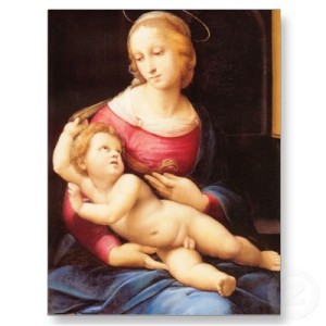
David Bowie, real name David Robert Jones, is a star in the music industry. He is particularly known for his musical transformations into obscure characters such as Ziggy Stardust, Major Tom, Aladdin Sane…to name but a few.

I’ve never been a real fan of David Bowie, only ever enjoying the well-known songs. but, the exhibition about him at the V&A museum has changed my view.

Overall, the exhibition was done fantastically. I really liked the huge screen and concert like atmosphere at the end of the exhibition.

The exhibition runs through the different areas of Bowie’s life, the clothes, the videos and film. Without even realising, I spent the whole afternoon absorbing huge amounts of information about David Bowie and what makes up this man.

The exhibition is called ‘David bowie is’. At first I didn’t particularly understand why it was called this but I soon found that David Bowie isn’t just a singer/song writer. He is an actor, artist, and designer. He is more than meets the eye.

A David Bowie artwork

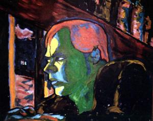
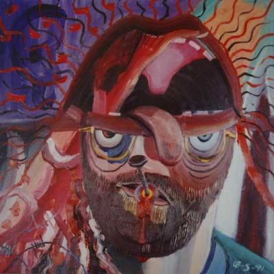
His artwork is full of emotion and colour- very much like his music. His paintings are abstract, full of definite lines and piercing stares.

I was really interested of side of Bowie, but I would not have known about it had I not had my eyes opened to the different sides of Bowie through this exhibition. I recommend everyone to discover the various sides of Bowie and the current exhibition, ‘David Bowie is’ is a great way of doing this. What side do you prefer?…aladdin sane album cover

Georgia O’Keeffe, Before Fame

Georgia O’Keeffe was an American artist who lived from 1887 to 1986. She was well-known for her abstract drawings of flowers. Her paintings are known for their fluidity and contrast. Her earlier work had similar qualities, but unlike her later work, which is full of colour, her earlier work is charcoal based.

Back in 1915- 1918, O’Keeffe was either taking art classes or teaching them. She was experimenting with different ways of painting and drawing. Her paintings were becoming quite abstract and full of self expression. What I’m particularly interested is her charcoal drawings. These charcoal drawings were what made O’Keeffe known in New York. She had sent the drawings to a friend who showed them to Alfred Stieglitz, a gallery owner. He then exhibited her work in an exhibition of his.

Like Alfred Stieglitz, I love these drawings. They are so different to her other work and they are a breath of fresh air. They are abstract but distinct. There is huge contrast between the black lines and the white paper. She also smudges some the charcoal to create tone. A drawing in particular is drawing XIII. On the left are flowing lines suggest a river and the curves of the right could be hills. The staggered lines on the right could also be mountains. I love the fact that we can’t be sure, it’s so abstract that we, the viewer, have to study the picture before guessing what we see.

The darkened lines of the ‘river’ may portray the depth of the water. The darkness of the charcoals gradually transforms into the bleak whiteness of the paper, which may indicate the shallow waters of the river.

The charcoal on the hills is blended in to create a smooth effect. This reflects the idea of rolling hills O’Keeffe probably tried to portray in the drawing. She has done a similar thing for the mountains. However, she has drawn a thin black line for the tops of the mountains. She then rubbed out the charcoal next to the thin line to create a ‘white’ line against the black line. This creates more contrast between the white and the black of the outline of the mountains.Georgia_O'Keeffe- 1915

The collection of drawings by O’Keeffe is so complex and interesting. I really hope you enjoy the others, which can be found using this link:

http://contentdm.okeeffemuseum.org/cdm/search

In my opinion they are the very best of O’Keeffe.

Portraying schizophrenia

portrait 15 Bryan Charnley’s art represents the serious effects Schizophrenia has on your mind. Diagnosed at 18 Bryan Charnley had to drop out of Leicester School of Art in order to combat his mental health disorder; Schizophrenia. In 1978, around the age 29, he began to paint again. In 1982, he began to address his inner life and his condition within his paintings.

Bryan’s life ended sadly, he committed suicide in 1991 with a painting left on his easel. This painting was part of 17 self-portraits Bryan he done whilst experimenting with his medication. Medication helps to stop symptoms of Schizophrenia and help people to cope with daily life without the worry of symptoms arising.

portrait 2  It is this collection of work that I am interested in because, with each painting, you gradually see Bryan’s symptoms returning. They become scarier and more frightening. You start to see what he must have been feeling and how his disorder was gradually taking over his mind.

Below is the link to his website which shows his portraits in order with a small summary of each on the left.

http://www.bryancharnley.info/1portriat.asp

I was particularly interested in portrait 2 because it really emphasises how much some people with Schizophrenia need their medication. Bryan had only cut back a little on his medication by the second portrait, and already the painting looks dark and deep, a complete contrast to his first self-portrait. The painting is made up of dark blues and browns. He looks confused, and in the background there looks to be an eye. In the summary he explains that he was feeling paranoid and felt sensitive to human voices (this explains the rabbit-ear as he felt like a wild animal).  I think you can really see the paranoia coming through the painting because of the eye staring at him from behind.

I was also really interested in portrait number 9. It is a very bizarre painting; very ambiguous and abstract. The lips around the outside could possibly signify the voices he was hearing. In the summary, it says he had hallucinations. This painting must be portraying how he saw himself during these hallucinations.

It is amazing to go through these paintings, one by one and see how his mind and his grasp on reality dilapidated and became obscured. He was an excellent artist and it is sad to hear of someone so young and talented die in such an unpleasant state. portrait 9

Philip Gray- To The EXTREME

‘An extreme artist’ as he’s known on his website, Philip Gray paints some fantastic paintings. Painting from what seems the top of the world to the very depths of the sea, Philip Gray will go on the most adventurous journeys in the name of art.

Originally from Cork, Ireland, then moving on to Dublin, he says that his love for the sea derives from living in Cork, and his creative and adventurous spirit coming from his mother. Gray paints dramatic and vivid scenes, scenes from across the world from glaciers to shores to rainforests. He seems to have every extreme scene covered.

How did I come about him? Philip Gray was my collision artist in my last project (Collision artist- a random artist added to your work to inspire and help you to differ your journey in your project). Collision artists are picked at random and I’m glad I randomly picked him. At the time of picking him as my next artist I had been studying Monet’s ‘water lilies’- pretty boring and Gray’s artwork really spiced up my own art. Ones in particular were of his pure shores and earth tones collections.

Image

 I loved the vivid blues and hues of the pure shores paintings and the technique used in the background of both the earth tones and pure shores collections.  I love how the paint is swept across the canvas vertically. This doesn’t create just one solid colour, instead there are a variety of colours appearing in different parts of the painting creating these amazing tones and hues. I love how in one of the paintings of the earth tones collection, it appears to have a greyish background. But then you look again and you see purples, blues, oranges, and browns fade in and out of the painting. The pure shores paintings look like a huge blue/purple scape. It makes me blink a couple of times because the colours are so prominent.

 I really wanted to try this technique myself and I experimented with different tools to try and recreate the affect. In the end I used a palette knife to recreate the water in my own work using Philip Gray’s technique. His paintings have really opened my eyes when studying water and I would really recommend everyone to look at his website philipgray.com because his art is so fluid and unique and completely different to what I have seen before.Earthtone collection

O China Tree! O China Tree!

Christmas is just round the corner and I’m sure many of you will be thinking about buying a Christmas tree soon. There is one Christmas tree that I found this year that has particularly caught my eye, and it’s in the town of Hasselt, Belgium.

Instead of buying a ‘normal’ Christmas tree, this town has created one out of plates and other pieces of china! From what I’ve learnt from the news, not all the locals love it and would have preferred a real one. One woman even said that she thought it looked too bare.

Screen shot 2012-12-09 at 18.52.23

Thinking about it I think it would be fun if my town had a piece of huge artwork displayed instead of a Christmas tree. The tree that my town has is not that interesting. It has a few lights on it, but it looks just like the one before that and the one before that etc. I think having some art that looks like a tree would be far more interesting. The tree has far more texture to it from the different sized plates. It would also illuminate in the dark because of the vivid white of the china. I think it’s a beautiful piece of work particularly as the plates aren’t all the same. There are also layers of cups randomly placed.

However, if it came to whether I had a piece of art like that for a Christmas tree or a real tree for my home, I think I would always pick the tree. This isn’t because I’m a traditionalist or because I love the smell of a tree (but it is a nice smell!), it’s because a piece of art like that should be appreciated. A piece like that, which is so intriguing and different shouldn’t be locked away from the public, instead it should be in the centre of the town.

 I also love the fact that this art piece isn’t only there to celebrate Christmas; it also is there to celebrate the town’s solidarity. The people of the town donated all the plates and cups and when placed altogether, the tree symbolises the town coming together for this festive season. This is a lovely message to send out, which is why I wish my town did this for Christmas, instead of placing a tree in the middle of town and throwing a few lights round it, then we could send our own message out to celebrate this festive season. Just a thought…

china tree

back in the day…

medieval artArt in the 13th Century, the medieval period, was more or less always based on the Bible. Art was for monasteries, churches and such like; people didn’t have it necessarily in their houses, so therefore the main theme would be religion.

Although the art of this time is beautiful, I actually want focus on how different the artists were at this time compared with other periods, like the Renaissance.

First of all, medieval artists were brought up in a very different way. They would start by being apprenticed to a master artist. The artist would be taught techniques by the master and eventually would paint unimportant parts of the painting…under instruction from the master of course. The artist would then learn how to paint apostles, and the Virgin Mary. The artist would then probably be taught how to copy and rearrange scenes from old books into new frames, until he could paint a scene without a pattern/model at all.

With these techniques under an artist’s belt, he could paint any piece of artwork created in the medieval period. However if you asked this artist to sketch the landscape in front of him, he couldn’t do it. This is because artists of this period simply did not sketch. This seems a strange idea to you and me because if you think of an artist you think of them doodling and sketching the whole time.

They also never seem to do actual portraits, which seems strange considering portraits make up a lot of art.  The way in which they would show who they were drawing was to add a crown, or a mitre, and just to make sure they would even write the name below!

It had never seemed to occur to them to sit down in front of the object/person and paint them. This is such a weird idea to me considering some of the greatest pieces art was done like this. So is it right to compare these pieces of art to the paintings of Raphael or Michelangelo? It is important to remember that many techniques had been conquered by the time the Renaissance had come along. But all the same, surely some of the medieval paintings look like sketches when compared to things like the Sistine chapel or paintings of the Madonna.

Both periods have interesting paintings that are good to analyse, but if you had to pick and compare pieces of art from these 2 periods, you would probably say that you think the renaissance art is more ‘arty’ than medieval art, I think I would. Is this because we see ‘art’ as representing scenes of life, therefore art should be representational of the world. Does this mean medieval art isn’t really art? Your decision…

A last point; without 13th century would the renaissance have happened?renaissance art